
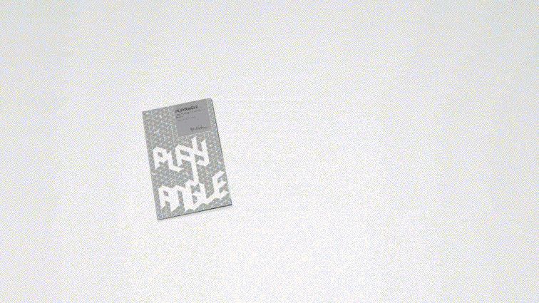
Milliken has recently launched a new floor covering collection dubbed as PlayAngle, and we were more than excited to collaborate with our client on this new line.
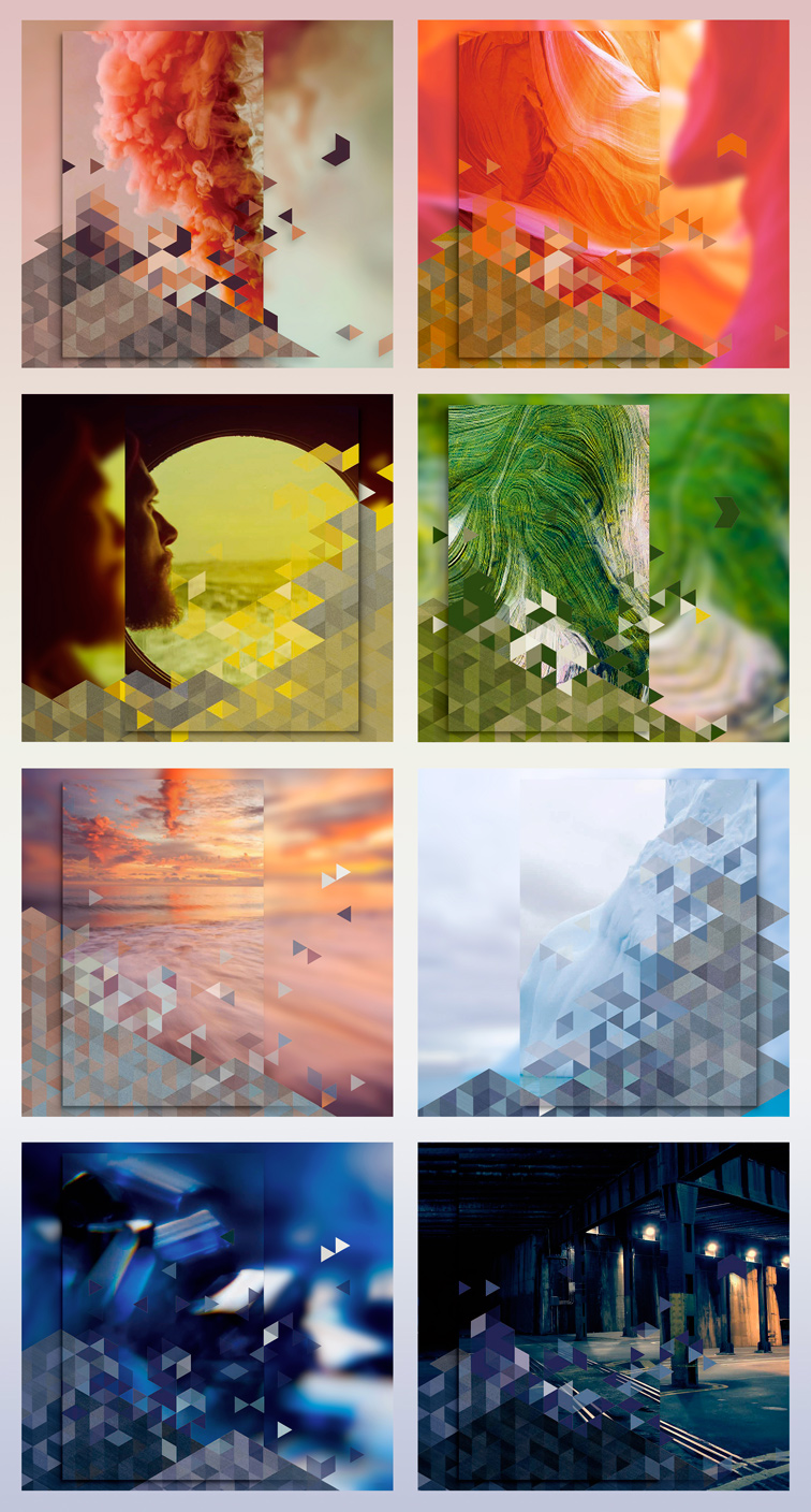
The PlayAngle collection features five different patterns and each one offering eight possible accents and colourlines – the possible number of combinations are just immense considering how beautifully these components can blend in together.
Designers can mix and match different patterns and colourlines to their liking – from high energy brights to rich neutrals – and bring about an endless possibilities of design inspirations to accentuate any environment.
The Brief
Milliken would like to create a marketing collateral that can highlight the ingenuity of PlayAngle and the whole design range of this collection.
Our Solution
Two things: Key Visuals and Installation Brochures.
Key Visuals
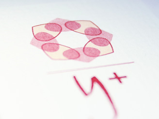
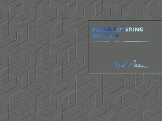
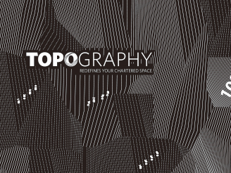
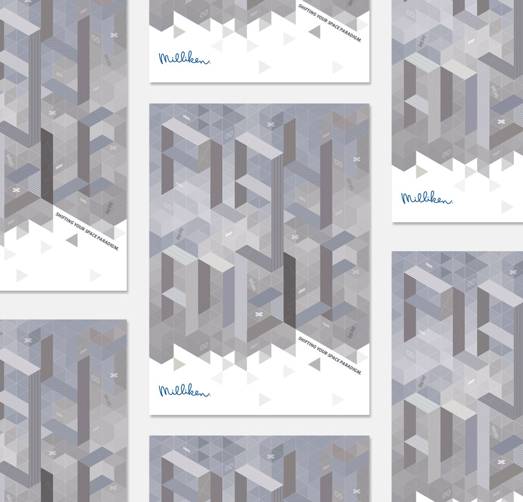
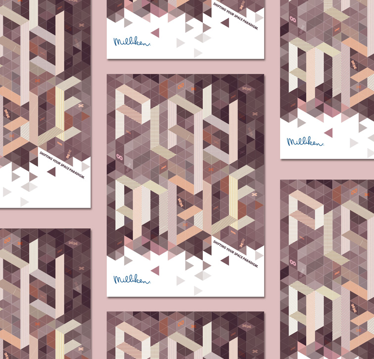
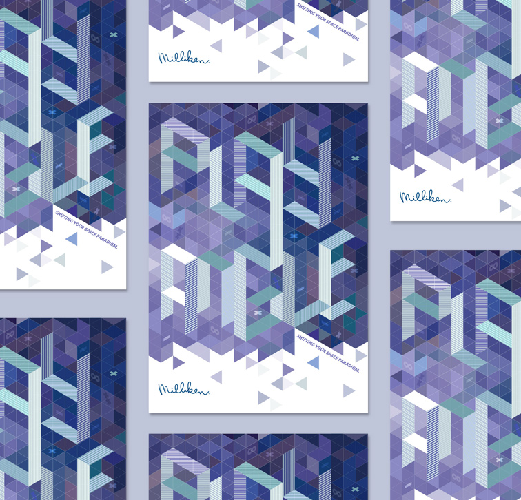
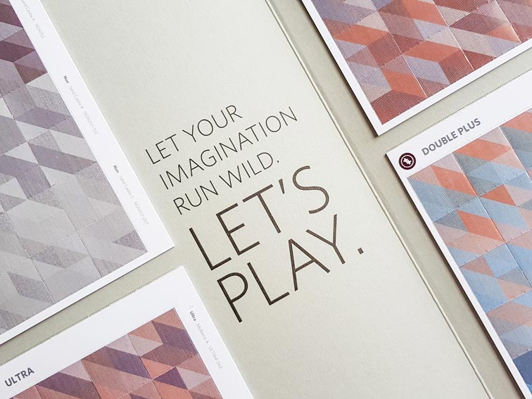
The key visual is a play on the triangle and lines which are the essence of the collection’s pattern. We used the facets to create optical illusion of a dimensional surface pattern along with the collection name. The end result is a bold statement.
The main concept our key visuals is the play on triangle and lines (which are the main essence of PlayAngle’s pattern selection). Using these, we created an optical illusion of a multi-dimensional surface pattern with the collection’s name “PlayAngle” etched out within the same facets. We strived to seamlessly integrate the brand into the design artwork and perfectly capture the idea of “creative play using different angles”.
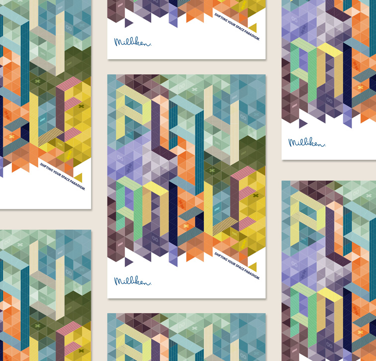
Our master key visual featured the full spectrum of eight accents and colourlines from the collection.
We also created three other supplementing key visuals using the distinct color palettes from Milliken, namely: Cool, Warm, and Coordinates.
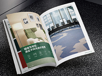
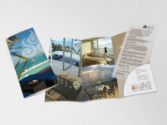
Installation Brochures
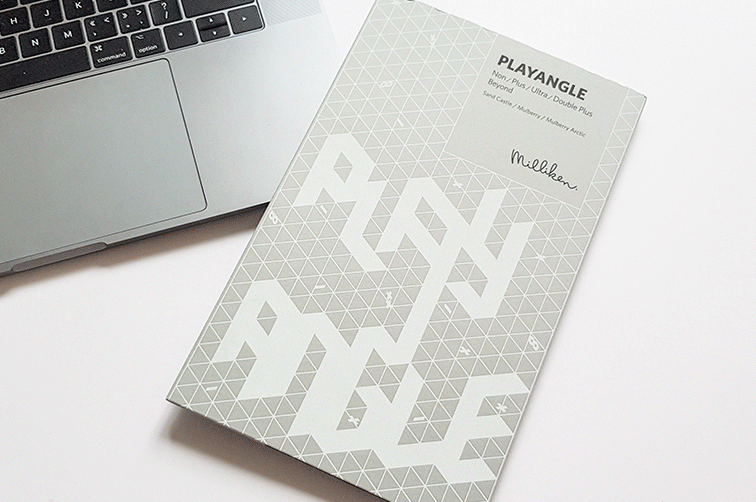
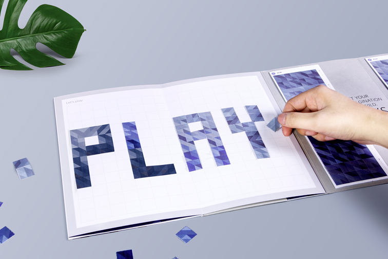
We wanted to create something that went beyond the standard brochure to showcase the collection.
We knew from the start the we wanted the PlayAngle brochure to be unlike any other typical brochure out there. We wanted it to be fun, dynamic, and above all, interactive -- exactly what the brand collection is all about.
We created eight versions of the brochure (one version for each colourline) to showcase the collection’s extensive palette. The brochure pages were designed in a fold-out accordion style, each page dedicated to how each colourline can be utilized as a standalone visual or as part of a bigger masterpiece.
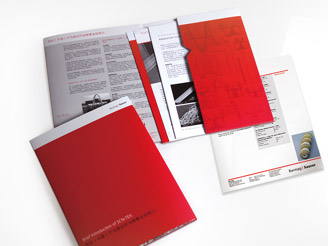
We wanted the concept of “play” as part of the way the audience will interact with these collaterals.
The backside of the brochure is where it gets more interactive. There is a grid area where anyone can create their own pattern structure. Equipped with four decks of stickers, users can easily experiment across different patterns and colourlines however they like and have a tactile experience of the whole PlayAngle system.
Nothing could be further from the quote about “putting ‘Play’ into work” because that is exactly what we did… we played and ended up with awesome work!
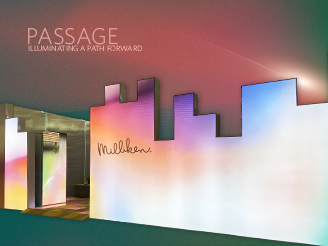
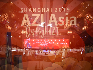
▲ Milliken’s new product launch event