

Travel accessories are challenging products to market because they’re grab-and-go items that consumers would typically not spend too much decision time on. You’d notice that travel accessory shelves at airports are a battlefield for the most creative packaging. Neck pillows, luggage locks, adapters, USB cords, the list goes on – how can brands create disruption?
In today’s article, we will give you a peek on the whole process we undertook with Chinese company Jiar Travelware to revamp the branding for their travel accessory line Smartrip. Our main agenda is to create a brand-new look that is contemporary, visually striking, and can speak to target consumers locally and internationally. We aimed to improve the brand logo, the packaging format, and the design tonality of each product selection.
Explore what’s already out there. We scoured shelves where travelers frequent and observed how consumers are making quick decisions. We then dissected and categorized the product competitors according to their branding and visual characteristics – an exercise which helped us efficiently identify market gaps and opportunities. In the end, we were armed with a good set of initial ideas for each design requirement to take into the client workshop.
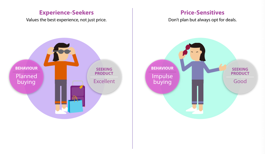
▲ Target Audience and Shopping Behavior
A blank white board to jumpstart the client workshop. We wanted our creative synergies to start from scratch. We presented our research findings to inspire the participants, and together we brainstormed how our ideas can fit what we intend to stand for in the market. A process of elimination was done to arrive at a clear guideline of design requirements and KPIs for our primary concepts.
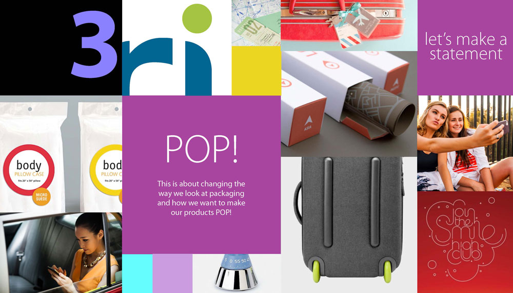
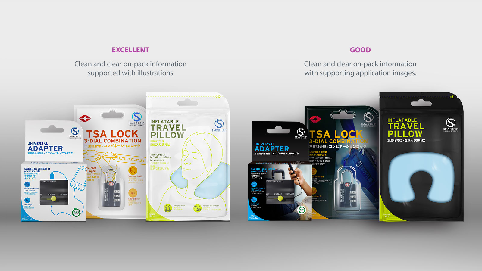
Taking it to the drawing board. Based from our guidelines, we experimented and came up with several full concept options under which we built the design elements of each product (universal adapter, TSA lock, beauty box, inflatable travel pillow, etc.). Each concept has its own distinct style driving the logo, packaging design, and pack structure.
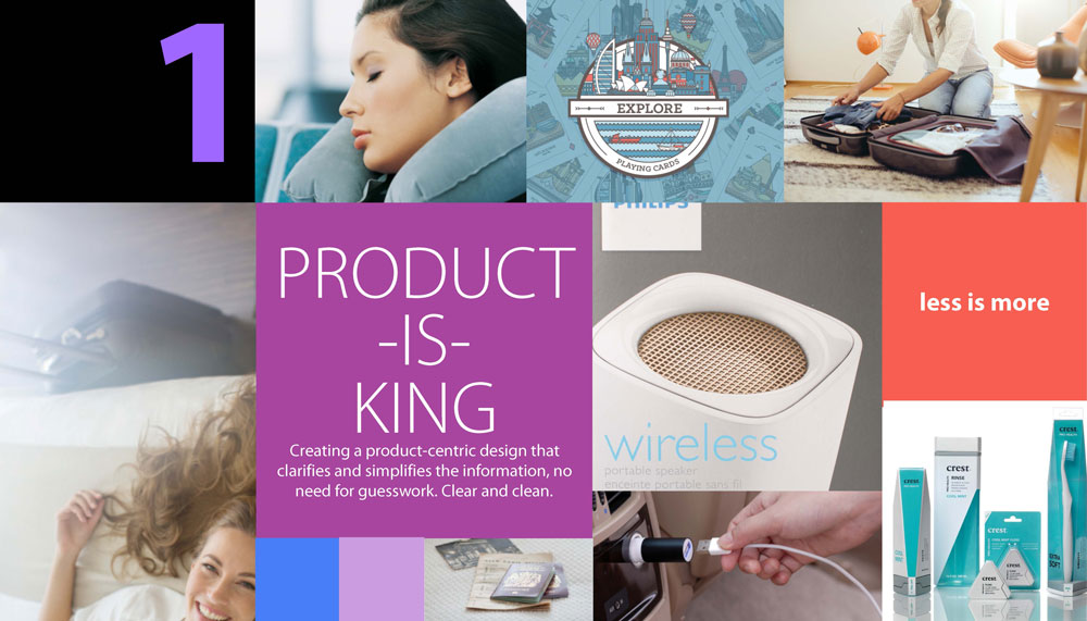
▲ Concept 1
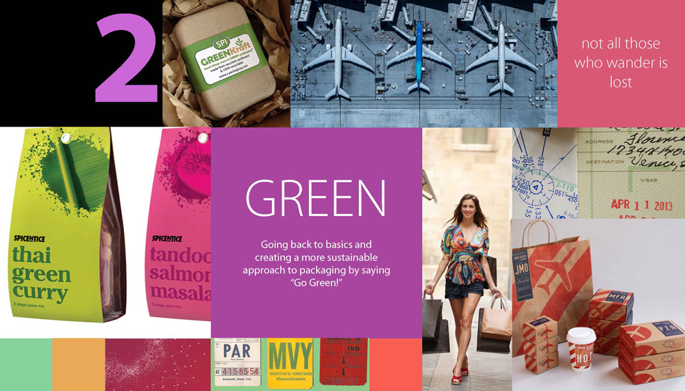
▲ Concept 2A
▲ Concept 2B
▲ Concept 3A
▲ Concept 3B
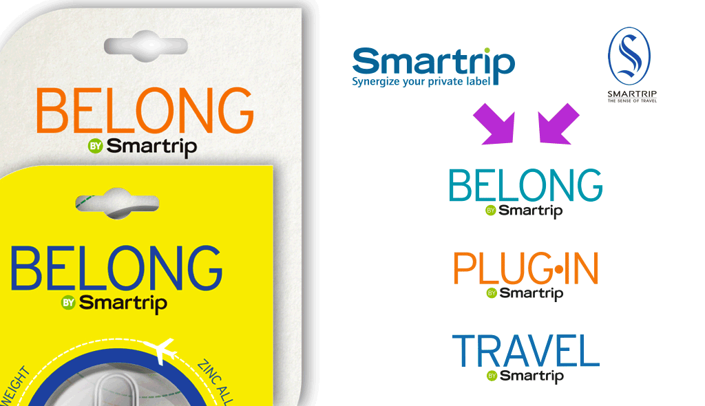
Choosing the best option. In the end, our client chose a final concept that was more universal and product-centric. We rolled this out to the rest of the product range.
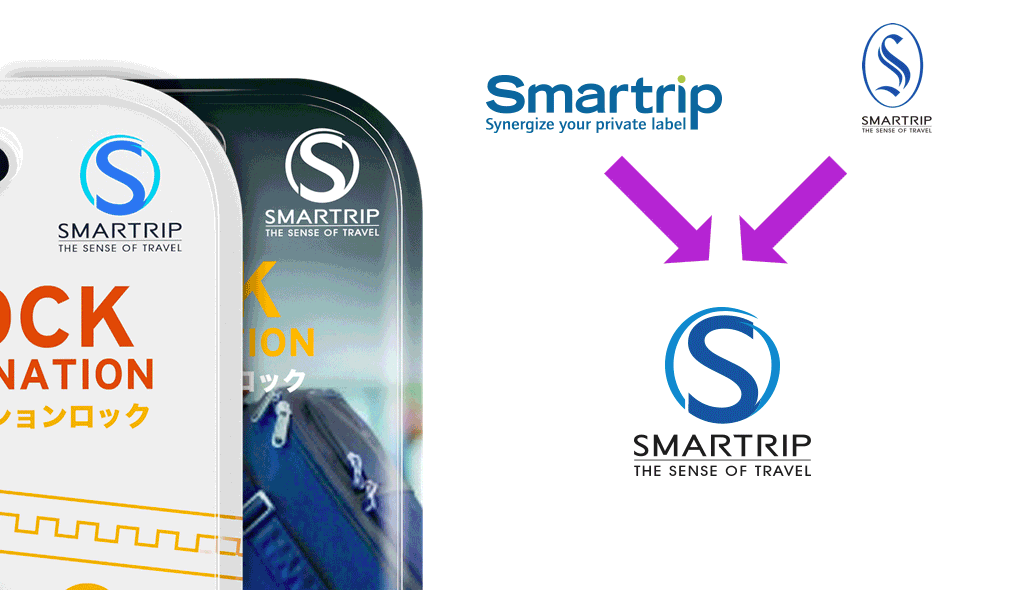
▲ Final Concept
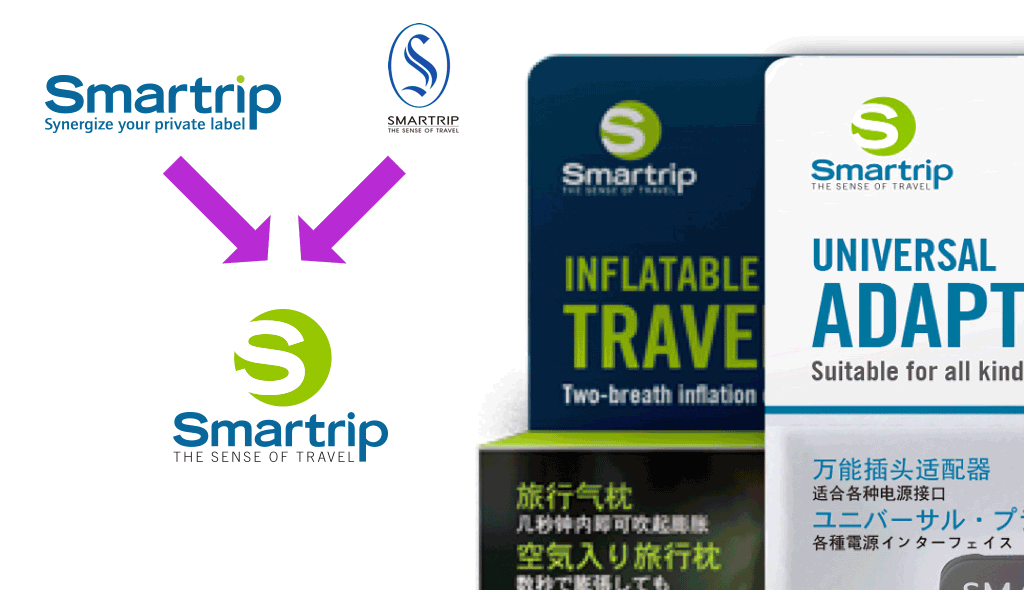
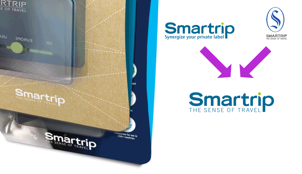
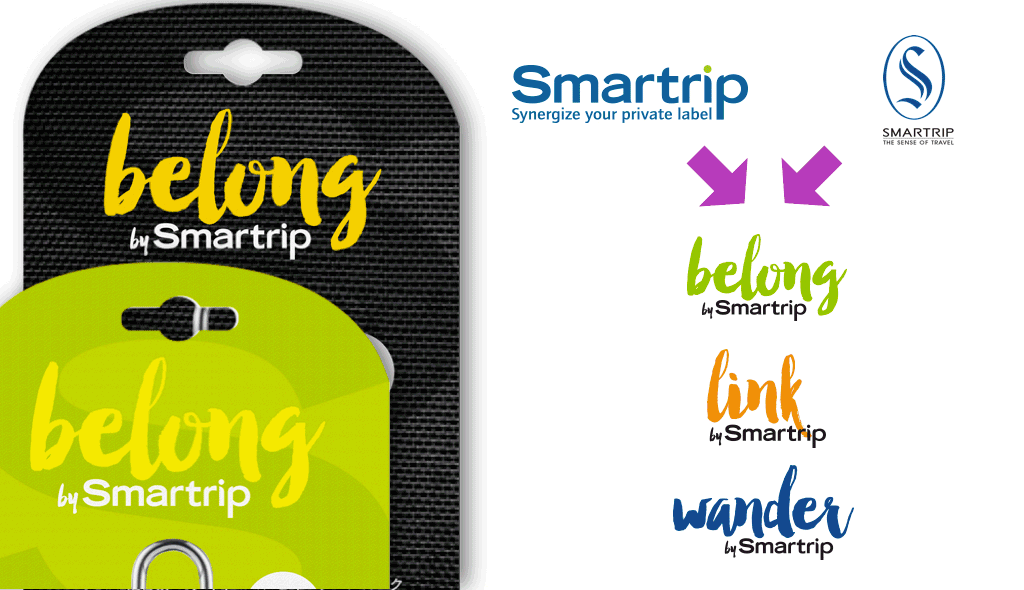
The Smartrip logo has been redesigned to be bolder and be more prominent on the pack. All the design elements point out what the product is all about and how it’s used in a simple yet cool, no-fuss way -- the actual product inside being an integral part of the design. With this stategy in place, we can only imagine a traveler in haste can easily spot and understand Smartrip products.
We hope that what we shared was able to give you a good idea of the immense work behind the curtains. It’s a cycle of research work, back and forths, trial and revisions, and finally nailing down the best concept and executions. It’s hard work, but nothing’s more rewarding than helping a brand successfully steer in a new direction.
Want to discuss how we can help with your product branding? Drop us an email at info@yaean.com.