
We continue to provide Henkel with annual visual design support, developing a cohesive and systematic visual identity centred on the team's shared values. Through this work, we help communicate a collective belief in the team's unity, momentum, and moving forward together.
Key Visual Concept
There are four key visuals for the entire event to distinguish it for the distributors and the AMI team. Within each of these two events, there are key visuals for both day and night.
The 2026 key visual features a galloping horse as its central motif, symbolising momentum, agility, and the power of collective effort. It reflects AMI's ability to move swiftly through industry transformation while remaining resilient through collaboration. The dynamic composition and fluid visual language convey a strong sense of forward motion and unstoppable team energy, inspiring confidence in the team's shared progress.

Logo and Slogan
The visual identity centres on the core messages "Unstoppable as One" and "Win Big Together." Clean and impactful in execution, the design is anchored by a striking accent of vibrant red that represents the team's shared passion, unity, and forward-driving force, reinforcing the team's collective purpose.

Panel Design
A series of display panels employs varied colour schemes to integrate business scenarios and product value into the visuals. Within a limited spatial footprint, the panels create a layered visual narrative that highlights AMI's collaborative ecosystem and continued growth.
 PHOTO CREDIT: HENKEL
Photo Zone
The photo zone extends the key visual into an immersive backdrop, incorporating the galloping horse's motion and bilingual taglines to enhance attendee engagement. Its flexible design allows attendees to take photos solo or in groups, supporting a lively and memorable event atmosphere.

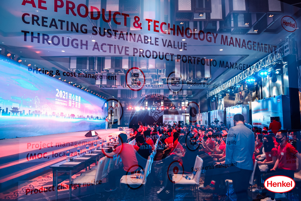
Another year, another milestone. Despite challenges faced in the first half of the year, Henkel's General Manufacturing (GM) and Maintenance, Repair and Overhaul (MRO) business and Electronics business units successfully ran their annual gathering.
The focus for the GM and MRO business unit was on the synergies and digitalization of the industries they cover. While for the Electronics business unit, the theme was about pushing the limits on innovation and sustainable solutions to significantly impact the electronics business.
Logo and Slogan
This logo designed for the GM and MRO business unit emphasizes the power of small drops and the positive impact LOCTITE products bring to the industry.
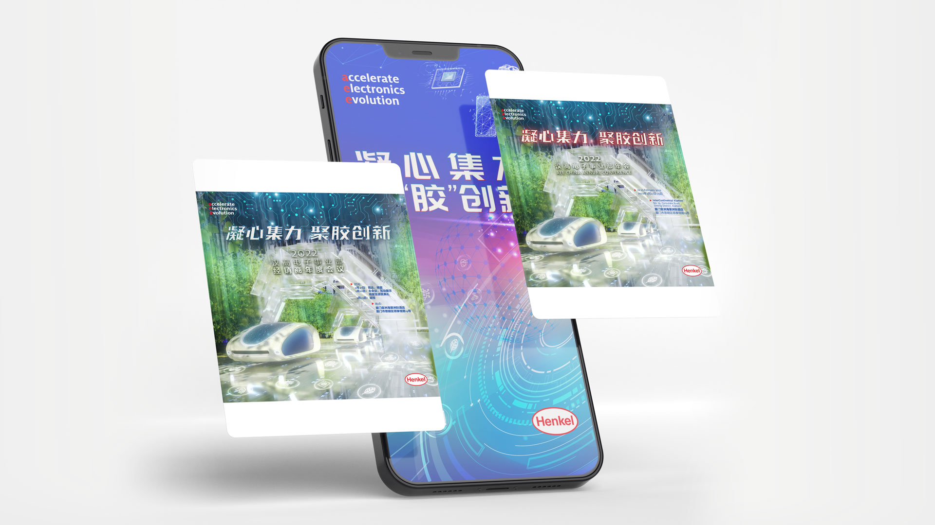
Key Visual (Dinner)
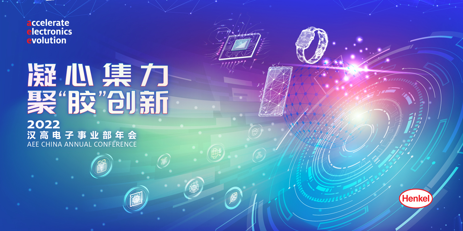
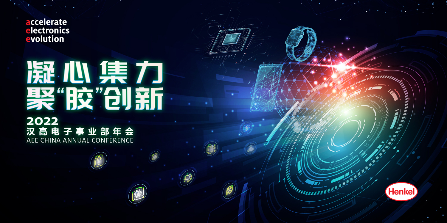
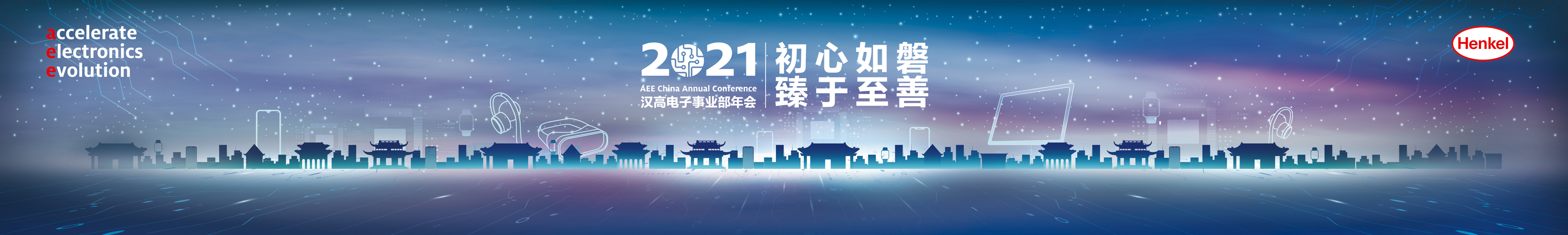
The key visual designed for the Electronics business unit's annual meeting underscores Henkel's vision of continuing to lead the future with innovative digital technology.
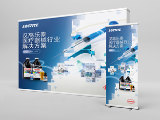
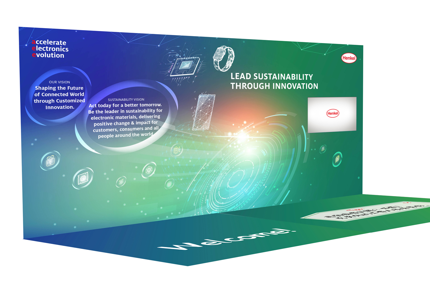
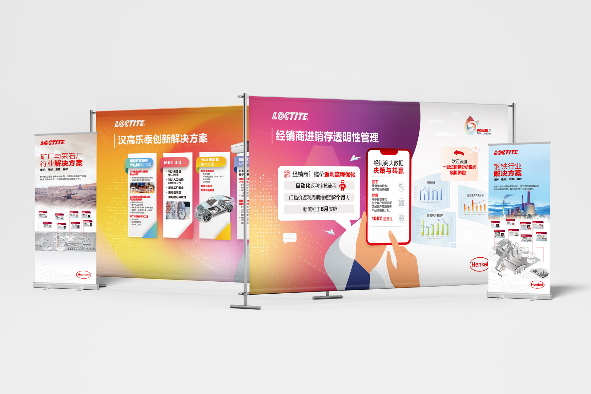
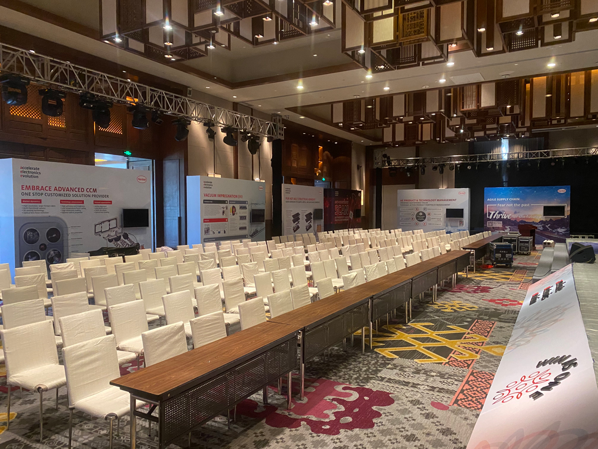
Booth Designs
The annual events typically include mini exhibition booths to showcase different applications and solutions, fully demonstrating Henkel's diverse portfolio for various industries.
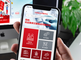
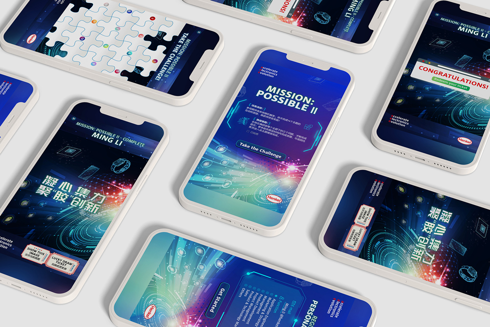
Mini Program Design
We also designed a small WeChat mini program for the Electronics business unit. The trivia questions and answers related to the booths were simultaneously displayed on the big screen to keep the participants engaged.
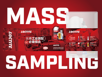
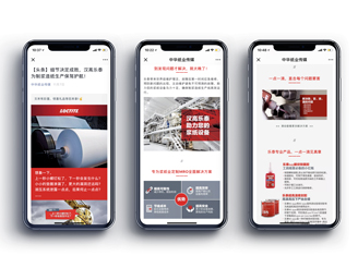
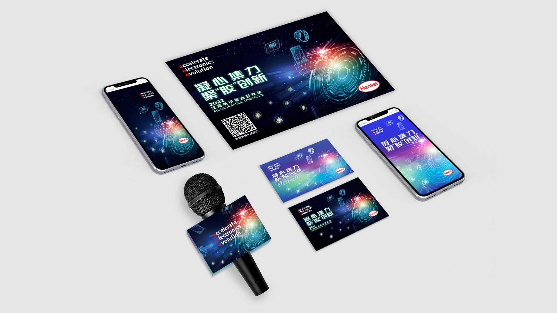
Other Communication Materials
此外,我们还设计了一系列宣传物料以及现场活动材料,包括邀请函、欢迎卡、台卡、主持手卡、好运签、云相册封面、大屏互动画面等,当然所有这些都与主视觉效果保持统一风格。
As with every year, the annual meetings are always a welcome challenge for us. This one is no different, and we are proud of what we have achieved.
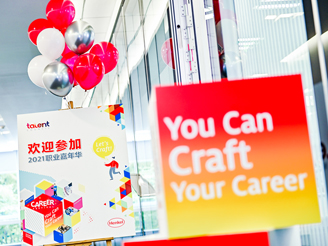
Scroll down the page to share more about the 2021 Henkel Annual Meeting.
We started from the ground making sure that we were able to encapsulate Henkel’s mission and vision in the main logo and slogan of the year’s event. After that was settled, we moved on to the executional points used on-site.
Since there were two events planned with their agendas, we had to tailormade different creative strategies for both divisions ACM (Manufacturing and Maintenance Division) and AEE (Electronics Division).
Logo and Slogan
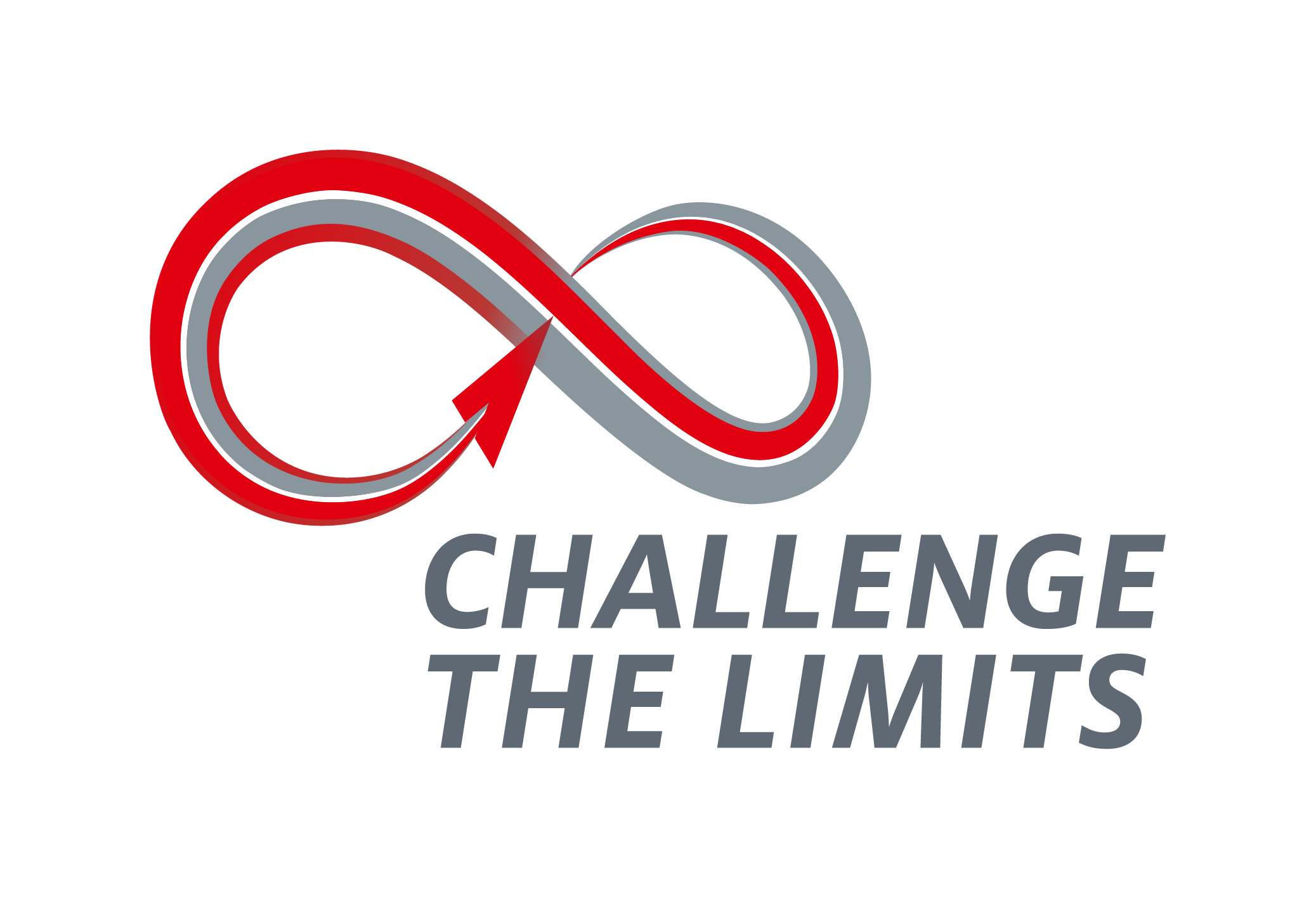
Henkel’s new strategy was focused on the concept of “Accelerated Transformation” by being the customers’ champion while increasing their readiness and scalability for the digital future.
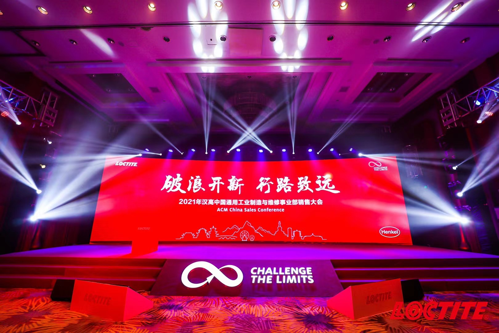
To specifically suit ACM’s event, we designed an infinite symbol of going upwards to serve as the conference’s logo and came up with the slogan “Challenge the Limits”, both signifying Henkel’s trailblazing status in the industry.
Conference KV
Dinner KV
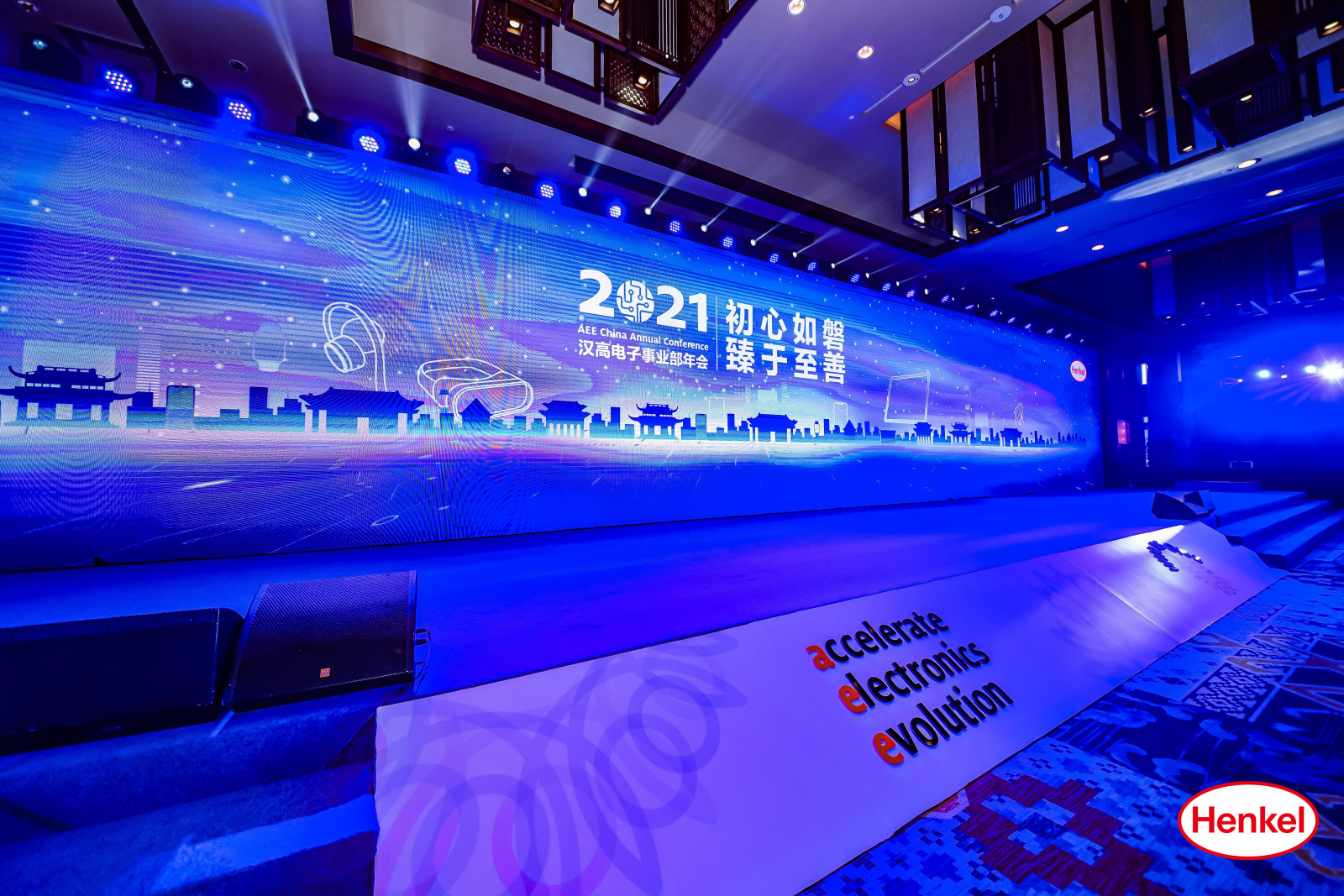
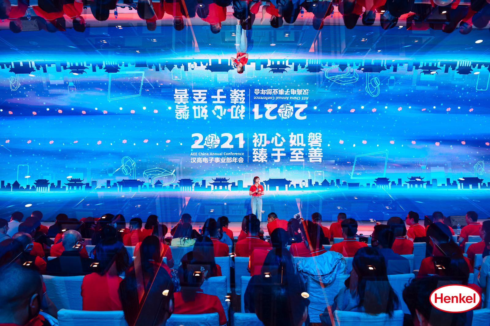
Our designed key visuals for the events of the conference captured the future prospects of Henkel which is to lead in transformative growth.
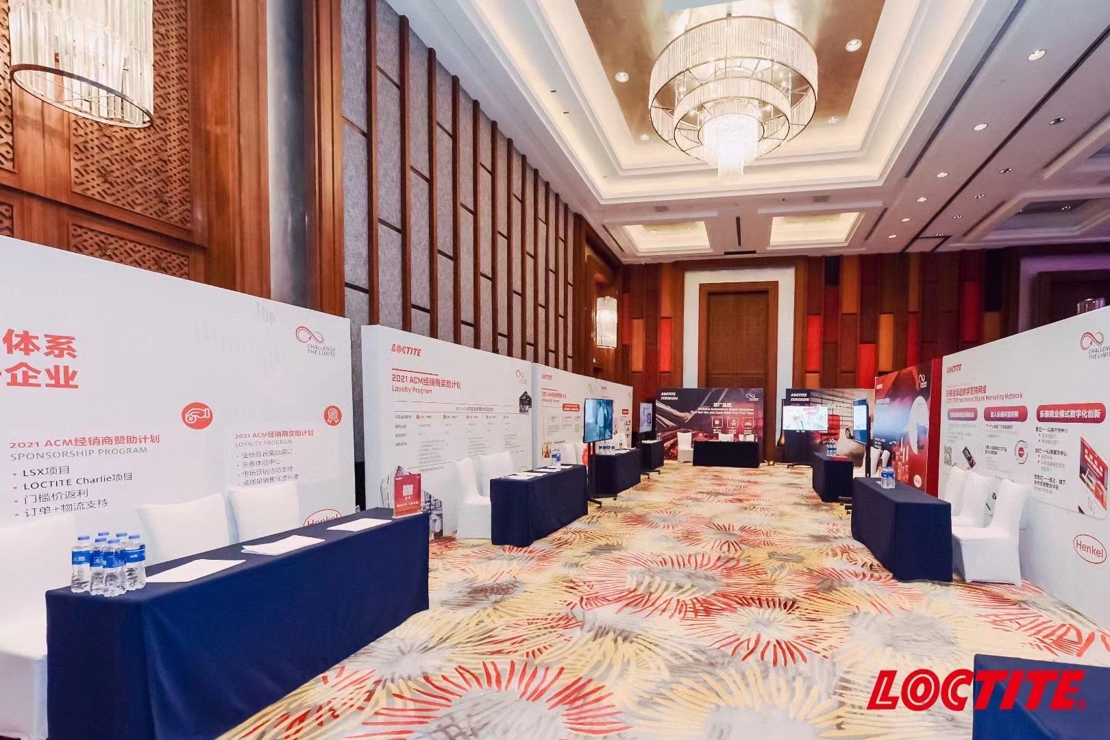
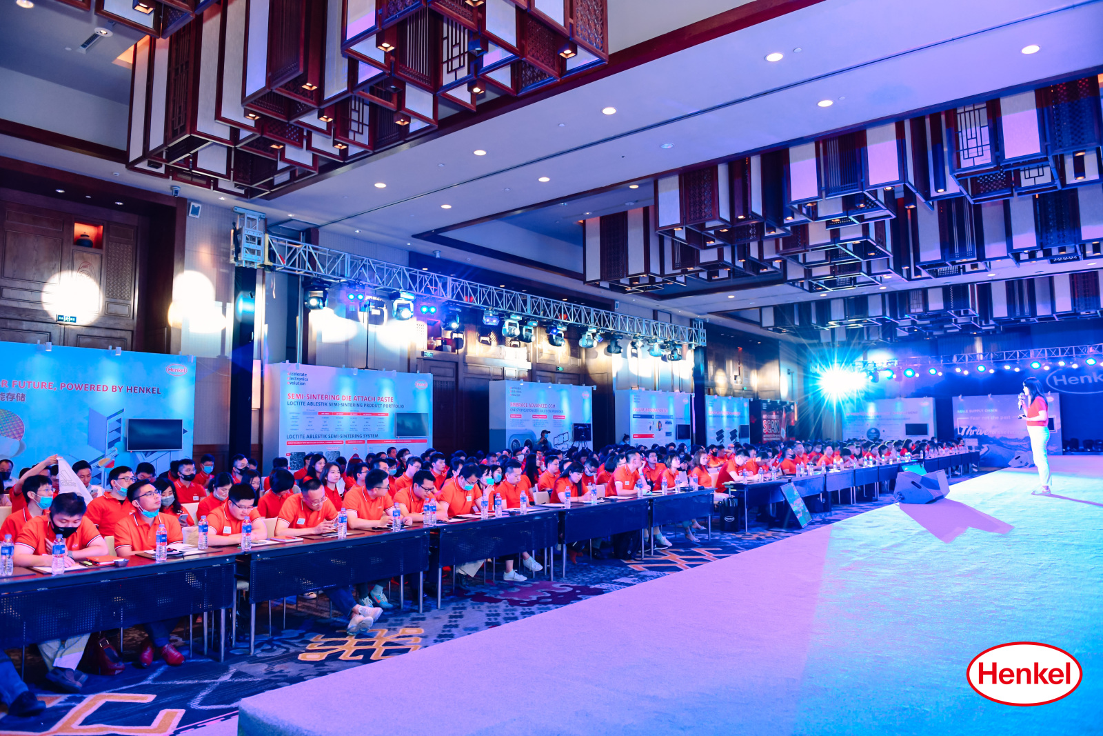
Booth Design
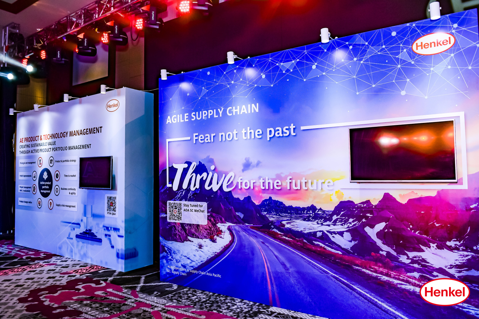
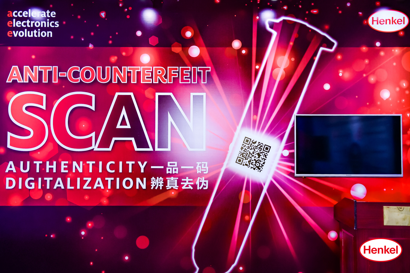
Different booths were extensively set up to showcase different product applications and their technical information. QR codes were prominently used, living up to the company’s path towards heavy digitalization.
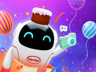
Mascot Design
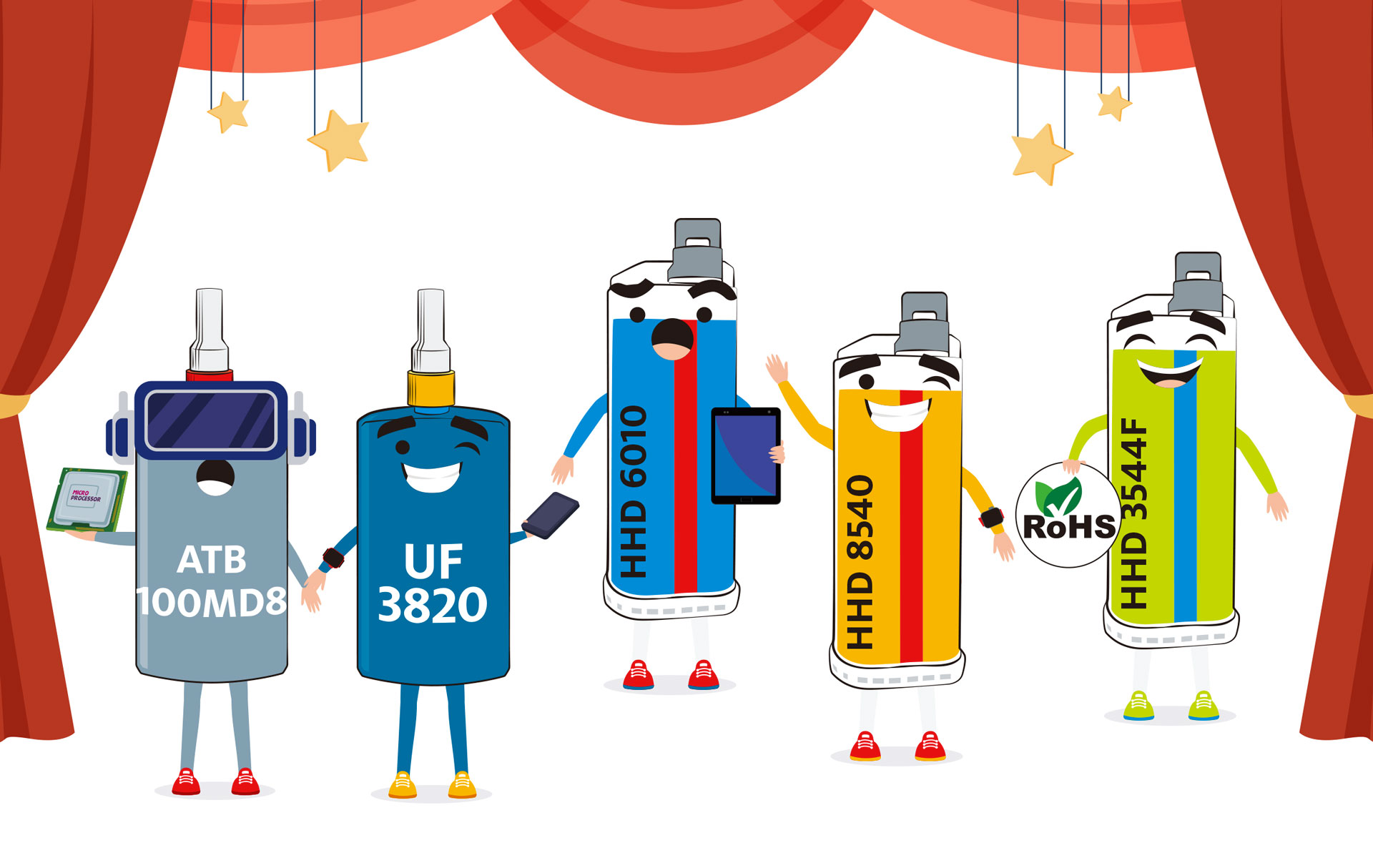
Adding some spunk to the Henkel Electronics business conference were our designed mascots! How fun are these?
Other Materials
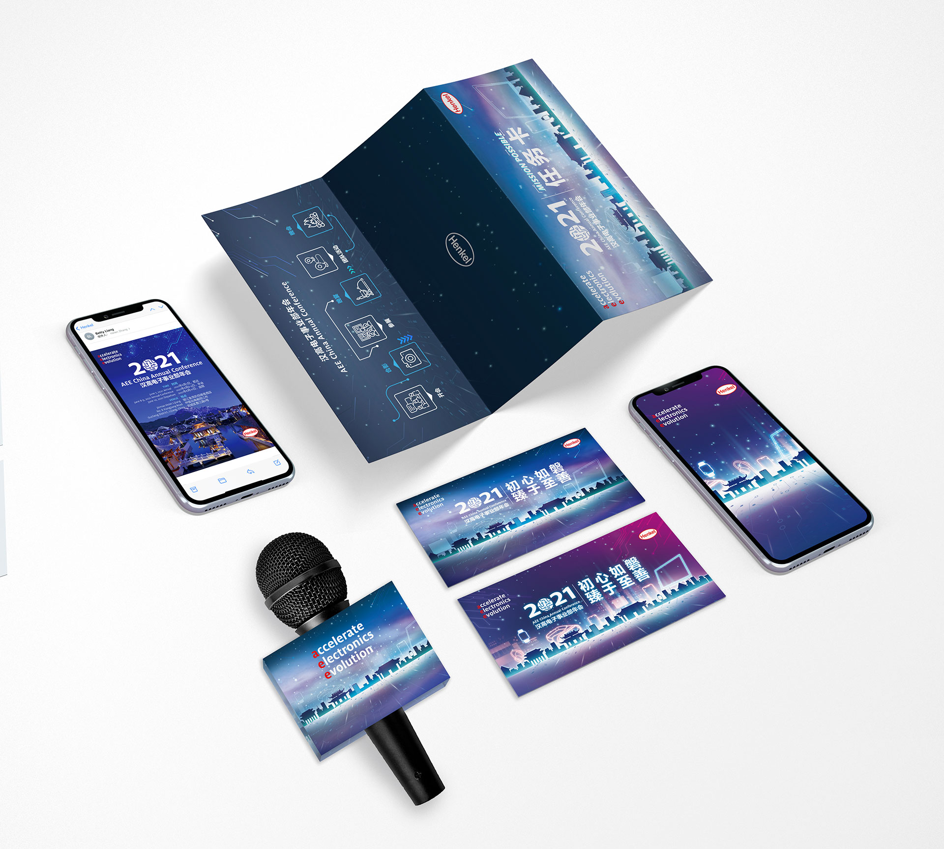
We also helped create various marketing collateral used across various platforms as well as the on-site materials (invitation cards, welcome cards, WeChat sharing photo, album cover for Cloud, large screen interactive QR code, etc.), all highly inspired by our KV design for thematic consistency.
The preparation for the conferences called for a wide scope of work on our end but we are proud to have helped the company launch the event with a bang. The event was a success, and we can’t wait to witness Henkel’s continuous growth across sectors!
For more information, email us at info@yaean.com.